The Bake App delivers a custom cake ordering process embedded within the functionality of a traditional food delivery app. It allows a streamlined order and payment process even for users who need custom orders and quick ordering methods.
Busy working professionals’ and housewives’ responsibilities consume most of their time. They want a convenient way to personalise their orders even when they are unable to visit brick-and-mortar stores.
Create an app where users can easily customize and order cakes in addition to ordering regular baked goods.
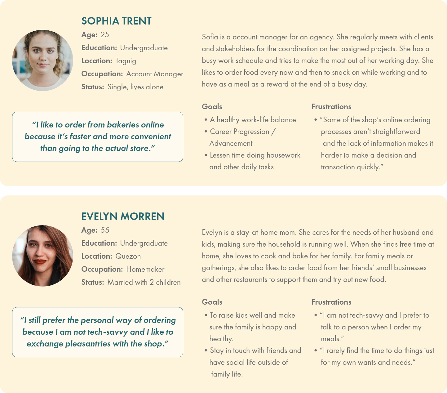
The user research involved conducting interviews and creating empathy maps to understand the users and their needs. Two user groups were identified through research – busy working professionals and housewives without much time due to their responsibilities.
The two user group’s problems had common themes – including their obligations in day-to-day life and the unavailability and ambiguity of custom online ordering methods.
Users have other obligations and do not have time to personally visit stores to make their orders.
Bakeries with existing online ordering methods use order forms that are disorganized and confusing.
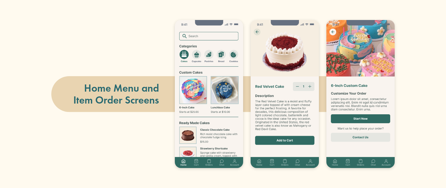
Some menu items do not provide images; users find it difficult to make a decision about their orders.
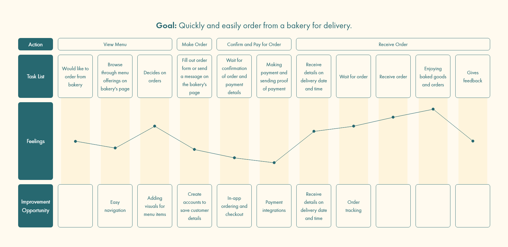
Mapping Sofia’s user journey revealed the pain points on existing bakery delivery ordering systems and opportunities for improving developments.
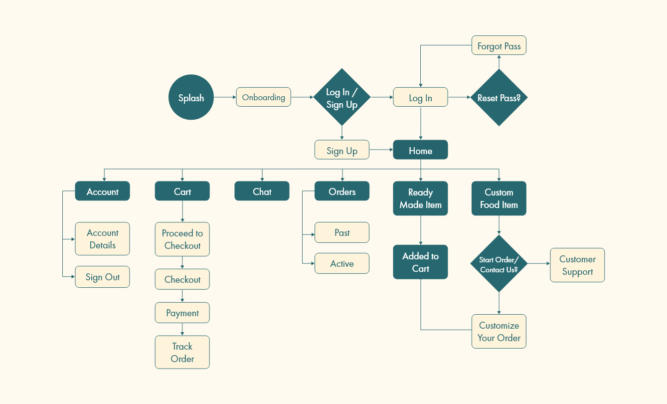
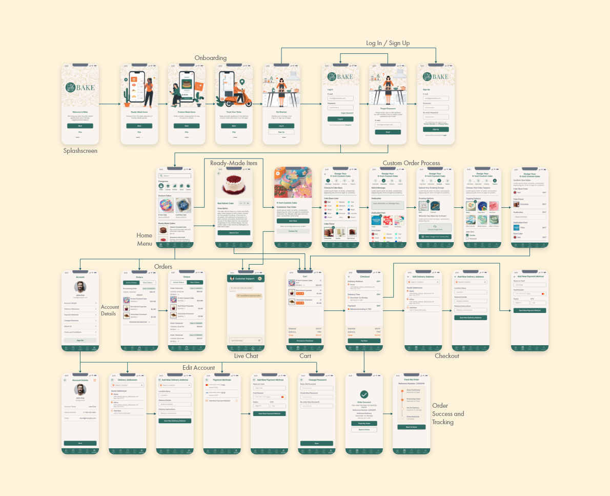
To clearly visualize the user's experience, the user flow was mapped out. The diagram covers the actions that the user can do within the app.
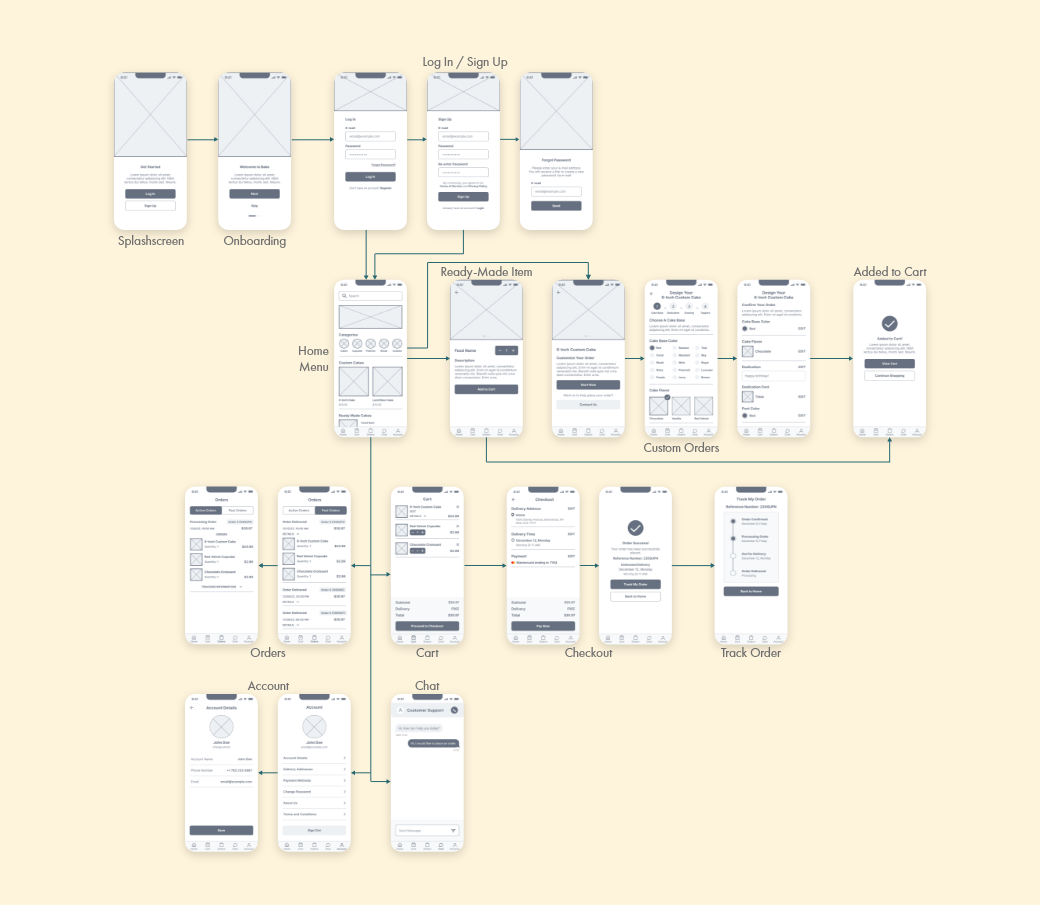
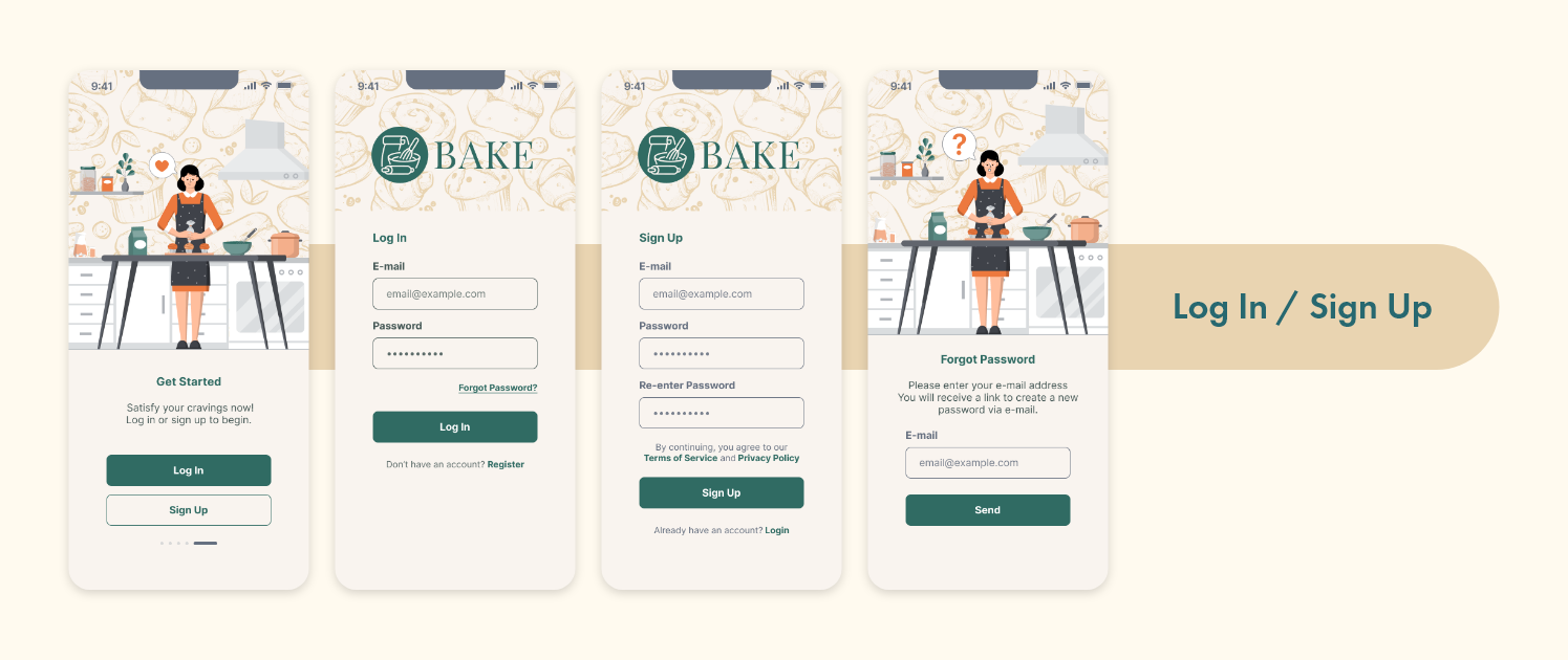
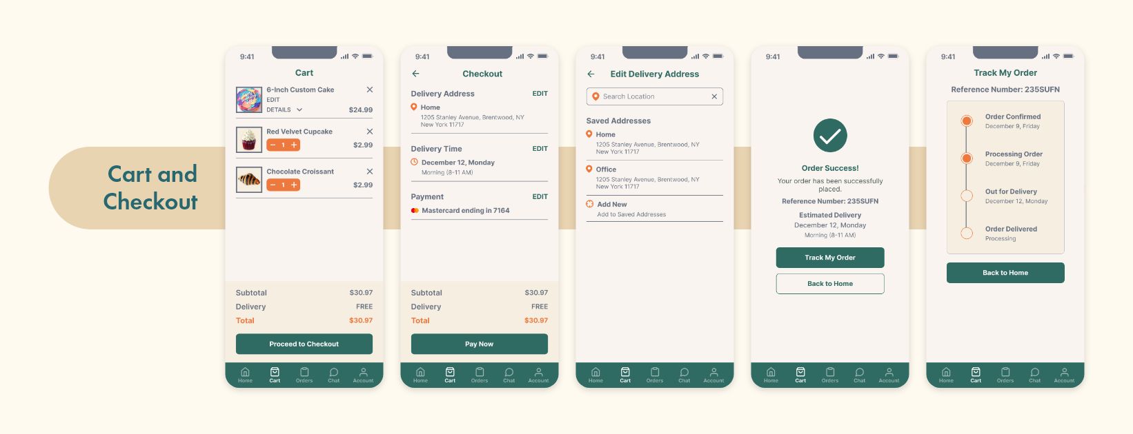
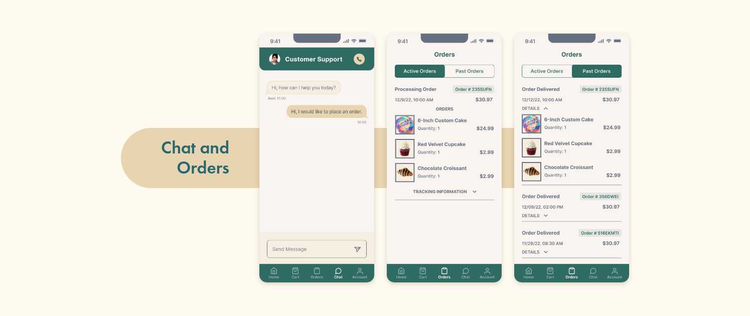
User pain points were addressed in the paper wireframes of each page for the app. The focus for designing each page was a streamlined user experience from launching the app up to tracking the orders.

Digital mockups were then constructed from the paper prototypes, based on the identified user's needs. Each screen addressed pain points from the user study.

A low-fidelity prototype was created to test the the primary user flow in the usability study.
Two rounds of usability studies were conducted for each phase of the project. Findings from each round of the study were used to revise and edit the prototypes.

The final high-fidelity prototype delivers a streamlined step-by-step customization and checkout process.


You can view the prototype below, through the link, or by scanning the QR code on your mobile device.
You can view the prototype by
scanning the QR code on your mobile device.
You can view the prototype by clicking the link or scanning the QR code on your mobile device.

Redesigning the search experience on a UK flat-share platform.
