SpareRoom is a UK-based flat-share marketplace that matches people who have rooms to rent with those who need them. This redesign focused on its search results page as one of the most critical parts of the user journey.
SpareRoom is a UK-based flat-share marketplace that matches people who have rooms to rent with those who need them. Users post listings, browse available rooms, message potential flatmates and arrange viewings.
When I was searching for flats, this site was recommended to me multiple times. However through my personal experience, I found the site inconvenient to browse through, so I ended up using another site which was easier to navigate.
SpareRoom has established itself as a clear leader in the flat-share niche. Having started in 2004, it has built trust with its large and active community. With housing costs pushing more people into shared living, the platform is wellpositioned for continued growth, provided it keeps refining its services, and continues to build trust and safety.
Given its status as the go-to-room rental platform, I find that the experience could be smoother, and that there is opportunity for further improvement.
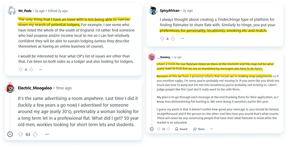
Aside from my own experience with SpareRoom, I wanted to gain more context and have a clearer picture of the experience that others have with the website.
I scanned through reviews and discussion threads to understand the general sentiments that users had with SpareRoom, to pinpoint common concerns and validate problems shared by those who use the site more frequently.
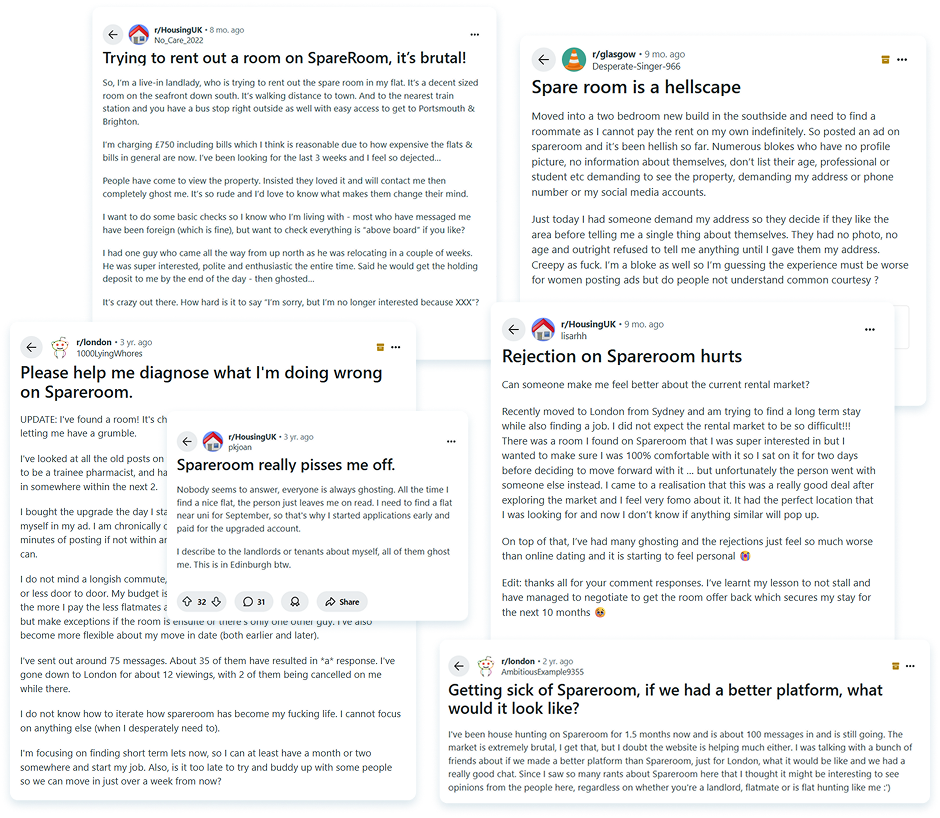
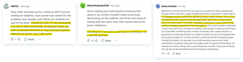
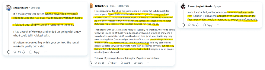
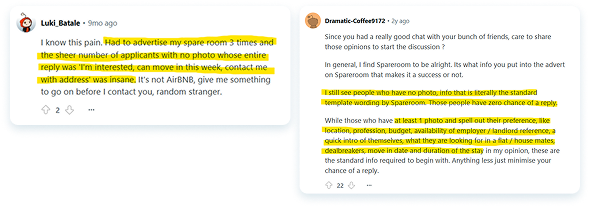
There were many complaints on both ends about the frustrating process of finding a flatshare and renting out their shared space. I was able to highlight a few responses and identify general themes in the discussion.
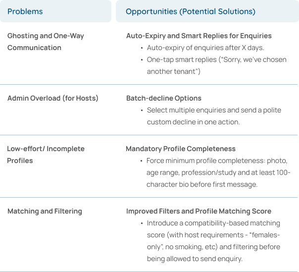
Given the context from the discussions, there are multiple touchpoints to improve in the user experience. In response to the problems I’ve encountered and problems mentioned in the discussion, I have listed some potential solutions and opportunities for improvement.
Since I will be working only on one feature improvement, I wanted to understand what to focus on first. I quickly evaluated these based on impact and implementation effort.
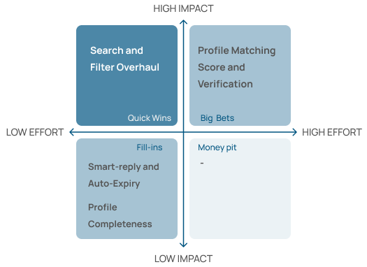
Although I highlighted four major pain-points, I decided to work on the Search & Filter flow since will provide highest immediate impact and feasibility. An improved Search & Filters flow impacts every user immediately and can be delivered in a single sprint.
In my own assessment of the user experience, I went through a heuristic evaluation to focus on touchpoints that presented friction in the user journey.
Here I’ve focused on the search results page, which is one of the first and most important touchpoint for all users. Improving this experience has the potential to deliver immediate, high-impact improvements across the platform.

In response to the problems I’ve identified, I've defined clear goals to drive the redesign process:
Before approaching the design, I also looked through the competitors of SpareRoom specifically to understand how they present their search results page and provide filtering options.
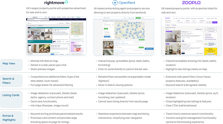
From this, I’ve highlighted the best practices that are being implemented on each platform. I have listed them below.
One of the first features I knew I wanted to highlight was an interactive map. I’ve noted that this is a standard for any property platform, so an interactive map should be central to the search experience. From my own experience and seeing how OpenRent implements theirs, I know how helpful it is to be able to visualise where listed properties are exactly located.
I wanted to understand how I could lay it out on the page without overpowering the search results on the page. I explored two layout directions:
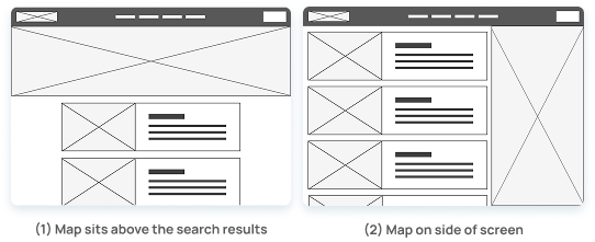
In my consideration, I noticed that placing the map on the top of the page would take up a lot of vertical space and would the search results too far down the page. That layout made the browsing experience feel less fluid.
I decided to go with a split-screen layout, where the map sits on the right and scrolls independently from the listings. This also makes it easier to reference locations while scanning through listings without breaking the flow.
I liked how Rightmove integrated their search bar by minimizing its size and having the navigation bar collapse once users start scrolling. It gives full attention to the listings while still keeping search inputs accessible.
Inspired by that, I designed a two-tiered navigation and search bar:
.png)
I also decided that the main navigation could be compressed into a single navigation bar which would open drop down menus for other pages, and that it did not need to have that much height.
This keeps everything tidy but still functional and makes space for more of the page content on the screen.
One of the issues I had with the current design was how inconsistent the titles on the listing cards were. Because hosts can write custom titles, there's a lot of variability. This made it harder to browse at speed.
.png)
I decided it would be best to standardise the listing card layout. I did a few iterations to figure out the best reading flow.
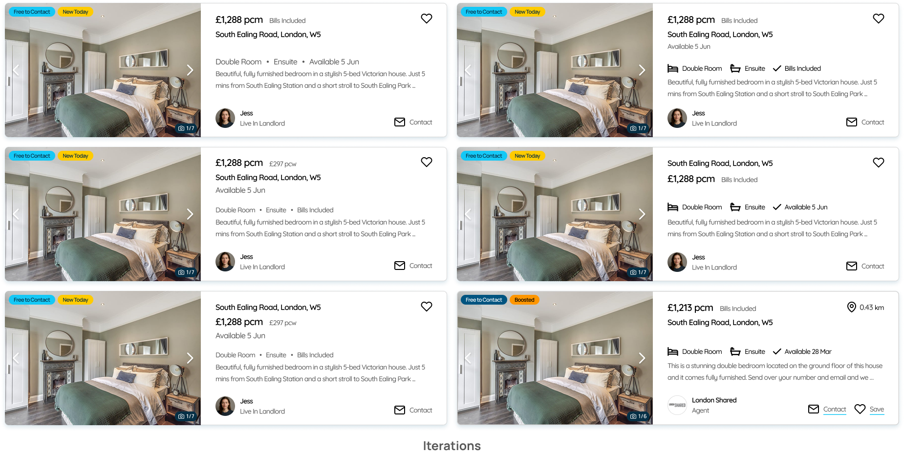
I settled on a consistent card structure prioritising:
Following the standard best practice, the images should display on an image carousel on the card. This way users can preview the space without clicking through to another page. I also grouped info chips (like "New Today", and “Boosted”) on the top-left corner of the image, so they’re easy to spot at a glance.
.png)
After finalizing the standard card layout, I created a variation that would be the “Featured Listing” card.
.png)
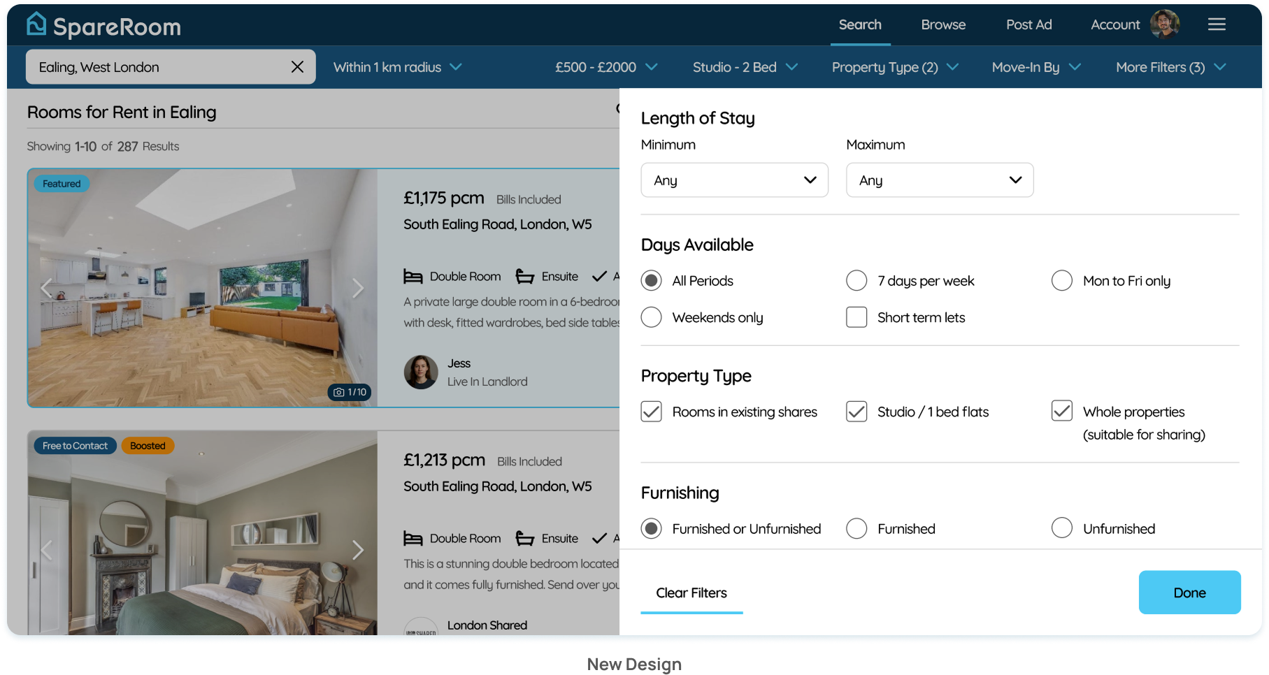
One of the biggest friction points I called out in the original site was how the advanced filters open on a new page, which totally breaks the search flow.
I wanted to fix that by keeping the filters within the same page inspired by Rightmove and Zoopla. I condensed the core filters (location, radius, beds, price, etc.) into the top bar, and used a modal side-panel to house the rest. This lets users explore advanced filtering options without leaving the page.
I also made sure the filters were tailored for flat-sharing, not just full-home rentals, since this is a unique differentiator for SpareRoom.
.png)
As part of the design process, I wanted to maintain consistency with SpareRoom’s existing brand identity so I compiled a catalog of visual elements and styles already in use across their site. Using this as the foundation, I’ve expanded on this and developed my own set of reusable design components to use throughout the new page design.
Establishing the system early on helps me streamline the current redesign, but also sets the groundwork for scalability if new features and designs are introduced in the future.
.png)
.png)
Overall, my approach was to build from observed user pain points and industry standards and layer in the features that improve usability, not just add visual polish. Everything in the final design ties back to real usability feedback, my personal experience, and successful patterns seen across other platforms.
You can view the redesign below or through the link.
You can view the prototype by clicking the link or scanning the QR code on your mobile device.
%20(1).png)
%20(1).png)
Case study of a gamified health application. Encouraging healthier lifestyles through engagement and motivation.
